Scrapbook page 82

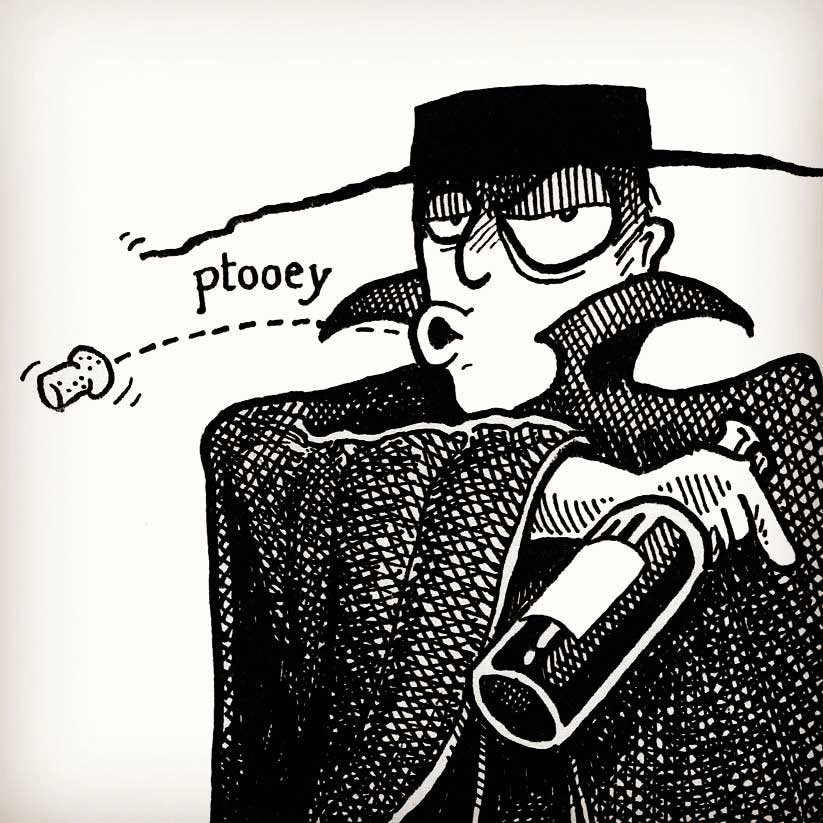
Detail from “Wineman” character branding, which included designs for letterheads, cards and — excellent to work on — a large transit van. In the end I don’t believe this was ever deployed, perhaps because it was clearly playing on George Massiot Brown’s “the Don” logo for Sandeman. It’s also a lot like The Concuspidor which I think I had been working on at around the same time, which was mid-1990s. It bothers me now that the cork is probably the wrong kind for the bottle (I didn’t know much about wine at the time; still don’t), but I still find ptooey funny. Especially on a logo, which I had hoped it would become.